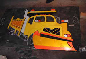
My Solo Project - Snow Plow Fabrication Phase
Going from Tar Paper to Aluminum
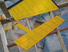
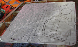
In the fabrication stage the life-sized template is used to trace the shapes that will be cut out of metal. I began by carrying in signs from the numerous sorted stock piles, located outside the building. By placing these signs next to each other, I was able to see how the various colors of the signs would work with each other and also how the shapes from the template would fit on the signs.
The road signs not only offered different colors but also different tones of each color. For example, stop signs vary from a bright candy apple red to a slightly darker raspberry shade of red. This difference, not usually apparent, becomes noticeable when the two colors are juxtaposed.
The slight variance in color became useful to create the illusion of depth without having to use multiple layers of sign. This technique was used to fabricate the chimneys on the Bentley Hall reproduction.
In addition to the slight variance in tone, the signs can either be plain, where a small amount of reflection comes from the paint; or reflective, where the paint itself contains small reflective particles. Both of these treatments result in further variance in color. By choosing signs that utilize the subtle difference in color, visual depth can be achieved without making the structure too heavy from numerous overlapping signs.
Text verses no text
Once the colors were chosen, the next challenge became mapping out the appropriate area for each shape. One of the major concerns, besides the inherent size of the shape, was how to deal with the text on the signs. Almost every sign contains some form of text and this must either be incorporated into the design or avoided all together.
In some cases, text can play a very integral role in the design process. Text has been used effectively in the green background and the water segments of the fence mural. This helps add detail to a section that would normally look flat if it was composed of a single uniform color.
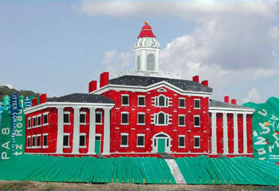
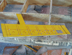
This is the reproduction of Bentley Hall on the Read Between the Signs project. It is an example of a structure using only solid colors from the signs.
On the other hand, the use of solid color can also produce emphasis on a particular object and help establish the difference between foreground and background. Bentley Hall and the Penn Dot truck are made from sections of sign that do not have any text. This was useful because the solid color made these objects stand out creating point of focus. I wanted this truck to be a focal point so I made the decision to omit text completely.
I learned from experience that mixing text in with a largely solid color scheme will hinder the visual impact of the object so consistency is a must in this case.
Mapping out the metal shapes for the truck
Deciding to stay with solid colors, I began to cut away portions of the life-sized template to see how the shapes would fit on the solid colored parts of the signs. I quickly learned that placing and rotating the shapes to avoid the text on the signs is an art in itself.
I have traced some shapes to cut on the sign with a sharpe marker. You can see the challenge of placing the shapes to avoid the text of a road sign.
The snowplow's blade was a good starting point because it would be one of the more difficult large sections and I wanted to create it from large, un-fragmented sections of sign if at all possible. This blade would also be placed an inch or so out in front of the grill of the truck to create an illusion of depth. This spacing can be achieved through the use of spacers placed between the layers of metal.
When you begin to trace a shape on the metal you also need to consider what layers will go on top of other layers in order to allow for some overlap. This is because the aluminum signs need to be bolted together and thus must share a common overlap to be joined. For this reason, I traced out the shape and included a secondary dotted outline for the overlap.
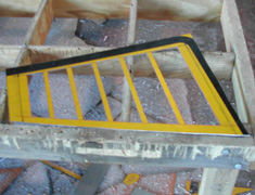
The blade of the snowplow
The blade marked the beginning of the snowplow truck. To make a convincing curved blade, I had to think about where light would strike it and where the shadows would fall on its surface. I chose signs with the lightest yellow color for the top for the plow and made the middle curved portion out of yellow reflective signs, these read as a yellowish orange color. By choosing a darker shade of yellow for the curved face of the plow, it would read as if it is behind the plow's upper lip.
The curved face of the plow could not be cut as a solid single shape, unlike the upper lip counterpart, so I chose to have the division points between the pieces cut as vertical curves. This vertical curve mimicked the actual ribs found on an actual plow's face. I also gave these sections considerable overlap so that the upper plow lip and the bottom scraper layers could have common points for attachment.
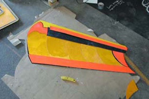
The completed snowplow of the truck. You can see how the subtile change in colors creates depth on the scoop's face.
I wanted to have the upper lip of the plow cast a shadow on the middle curved face. This was achieved by adding a small section of orange sign up under the lip. The upper yellow lip of the plow tended to blend into the cast shadow. This was corrected by adding a small section of black sign to create a hard line to separate the lip from the orange cast shadow. This technique was also employed at the bottom of the snowplow to anchor the bottom scrapper section and give it a slight shadow.
The plow was completed and placed on the floor. The shapes were not bolted together. I wanted to complete the whole truck and see if it looked right before attaching anything. This way, if something looked off, I would not have to disassemble to change out the undesired section.
The right fender area
With the plow section completed, I choose an adjacent fender area, working my way out from the central point of the snowplow. This area encompassed the rightmost fender and light.
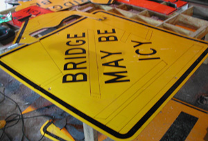
I went with a darker yellow sign for this area to make the fender a middle ground behind the grill and hood of the snow plow truck. These darker yellow signs are not as bright as the lemon yellow, "Bridge may be icy" signs, but are not as dark as the yellowish-orange reflective signs.
The truck's hood and grill area would be made from the lemon yellow signs. Coloristically, it would place grill and hood section in front of the far right fender and light post areas.
I decided to physically place the right fender and light post sections back an inch with spacers. I cut the fender and light post shapes, remembering to allow some overlap to attach to the hood and grill of the truck. I created the lights that belonged on this area. The upper light that is situated on top of the light post has a black encasing. I extended the black encasing shape at the base to create a defined shadow at the top. This black shape matched the bottom light and repeated the shadow scheme found in the snowplow blade.
The truck's grill
Once the side section was completed, the next point of interest became the grill section of the truck. By comparing the colors used for the right fender and light post color against the lemon yellow color of the plow blade, I could see that the hood and grill sections would need to be pushed forward if they were constructed from the same lemon yellow signs.
I wanted to duplicate the same style grill that I had on my first truck rather than having the grill monochrome black. For this design, I used the "sharp turn" signs that have the large black triangle in the center. These would have silver horizontal bars placed on top of the design and then joined together later by bolts. I was happy to get the design completed and leaving the silver bar shapes for later.
Front of the Truck
The actual front section of the truck was next. In theory the lemon yellow scheme would place the hood and grill regions in front of the far right fender and light post sections, but I wanted to cut the shapes and see it.
The shapes for the hood region were extremely hard to obtain, even from the largest of the lemon yellow signs. Since the overall shape would be constructed from multiple smaller shapes, I made a conscious decision to make the seams work with the existing lines in the truck. The diagonal separation within the hood slanted in the same direction as the perspective lines within the composition.
I crafted the passenger side door and the left fender out of lemon yellow so these parts would stand out visually. The other head light, situated on the left side of the truck, had a similar black encasing as the right headlight. As before, I extended the bottom of this shape emphasize the division line between the hood and the side of the truck with a shadow.
Top and bed of the truck
The front of the truck was completed and I could clearly see that the lemon yellow made it visually stand out from the adjacent right side, fabricated from the darker yellow. This contrast worked well so I continued by tracing and cutting the pieces for the top of the truck and the back side section. To keep these portions as continuous as possible I had to use the diagonal portions of the sign, working my way around the existing text.
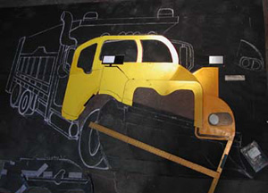
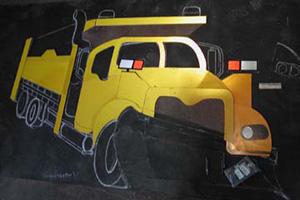
The front and cabin sections of the truck are completed. You can see how the different shades of yellow sign creat the depth of the truck and push the hood and grill sections to the foreground .
On a real Penn DOT truck the side of the bed, would be silver or grey. Taking into account where this truck would be positioned on the fence, I chose not to use this color because the fabricated roads on the fence are silver. This would make the bed of the truck blend in with the road.
I cut the shapes for the side of the truck bed with the plan to create recessed areas. I discuss how I create the recessed areas later in the next section. For now, I was more concerned how the general shape was going to look. While I was on the truck bed area, I created the black shadow area that would be the underside of the truck's top.
Completing the Truck bed
Completing the back side of the truck became my next priority.
The shape for the side of the truck bed, with the recessed vents, had to be divided between a top and bottom section because the shape was too big to be cut from a single sign. This task involved extra precision to ensure the vents on both halves lined up.
The width of the vent slots had to shrink slightly as they receded into the distance to retain the perspective and a sense of depth. This was achieved by having the width decrease a quarter of an inch as they moved from the right to the left on the side section. Rectangular vents were traced on the sign and four holes were drilled within the corners of each vent. These holes were necessary to get the blade of the jigsaw on the inside of the shape to cut out the hollow vent regions. The vent shapes were cut out from the top and the bottom sections. I placed these completed shapes, along with the snowplow blade and grill, back onto the template to see how the overall composition of the snowplow was coming along.
The top of the truck and bed of the truck arev completed as general shapes. I still need to make the trucks bed slotted and cut away the inner shapes.
The next portion was the tarp section that would go on the top of the truck bed. I choose a yellowish orange sign that had diagonal black strips. This would allow me to create the top of the tarp but have a more interesting pattern than just a monochrome black shape.
For consistency, I wanted to have the recessed vents made out of the same yellowish-orange sign that I had used to make the tarp section. The vents needed to have a shadow at the top to give the illusion that they were recessed. I achieved this shadow effect with just a single layer of sign. The yellowish orange sign had a one inch black border around it to begin with so I situated and cut the shape out of the sign allowing for an inch of the black border at the top.
This shape was placed under the lemon yellow truck bed side with the vents. Planning ahead, I will place a spacer so that it will be recessed slightly for depth and additional shadow effects when I attach these together during the assembly phase.