The Process - My experiences as an Allegheny College Art Intern Team Member
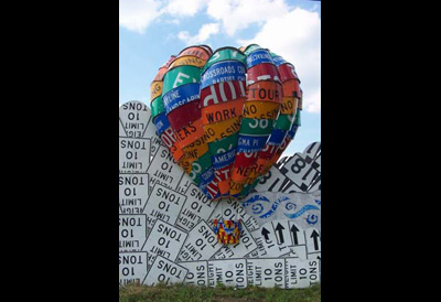
I have had the privilege of working on the sign fence project for two summers. It allowed me to not only branch my art skills to a new realm, but also experience the joy of working collaboratively with other artists. During my first year I worked alongside fellow artist Julie to construct three-dimensional hot air balloons for the fence mural. I was chosen for this task because of my strong sense of mathematics and geometry. Some rudimentary Calculus helped, but most of the custom bending for the balloon's fluted seams was done through the trial and error approach.
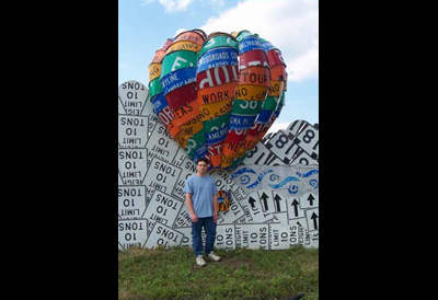
Here is a picture of me (5'11") standing next to the 12 foot balloon for reference. The balloon was three feet off the ground so it stands at a massive 15 feet.
The Penn DOT employees were eager to join the creation process when the installation time came. They worked along side of us as co-partners, lending their expertise and equipment to help solve numerous installation problems. I had a preconception that it would be a burden to them to give us a hand. It turned out that they loved the opportunity to help out and it was a refreshing change from the normal everyday work they have to do. It was amazing to experience the pride that the employees have in this fence project. This is the only one like it in the United States so far.
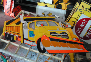
The second summer as an intern, I had the task of constructing a huge Penn DOT road construction vehicle for the fence and Allegheny College's Bentley Hall. The artistic design of the fence took an extreme turn from abstract to realism during this summer. At the end of my second term on the project I was contracted to create a three point perspective snowplow, which would be used for the winter section of the fence.
The chance to work on a public art piece really excited me. I was able to grow as a collaborative artist and understand the value of teamwork in the undertaking of a massive project. About the only thing I gripe about is how hard it is to get all the aluminum metal shaving off of my clothes and the interior of my car. I guess this is a small price to pay for a rare chance to work with some of the most talented artists I have had the pleasure of meeting.
The Formal Process - Conception to Implementation
Many people were curious about what the "Read between the Signs" fabrication process entailed and sent me a lot of inquiries. As with any major undertaking, the Read Between the Signs mural takes on several phases to arrive at the final creative project. Normally I couldn't begin to describe the experience because it is a team effort involving many different roles and the tasks are divided among many people.
This is the completed snowplow from my summer internship solo project. The plow is shown with customized details such as the snow on the snowplow, the bulldog emblem hood ornament, and the PennDot logo on the door. I could not get a more upright shot because the structure now weighted well over two hundred pounds.
In my freelance project, I was able to explerience the whole process from beginning to end on my own. In this circumstance things are controlled enough to accurately document the whole process. The documentation for the 3-point perspective snowplow included all phases of development for the interested view, which included:
Entire Fence Mural Project
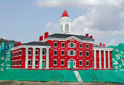
Read Between The Signs Project - Allegheny College's Bentley Hall
This is a replica of Allegheny College's Bentley Hall. I originally drew this on a 8 1/2 by 11" sheet of graph paper and then enlarged it to 10' by 15'. The roof even slants back at a fourty-five degree angle.
Read Between The Signs Project
Here we can see the upper end of the stream. We needed the stream to vanish into the hills so we used different shrubbery and green shapes to indicate depth as the stream zig-zaged into the horizon.
Read Between The Signs Project
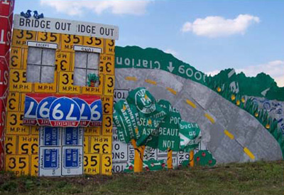
The older large green highway signs were supported by beams which could be detached by drilling out the rivets. The newer highway signs have the beams integrated into the sign itself so we had to make use of the strips in between instead of using the whole sign.
Read Between The Signs Project
In the stream section we have three sections of jumping fish. The idea is that these will be connected to a solar panel in the future and be able to rotate, mimicking fish jumping out of the water.
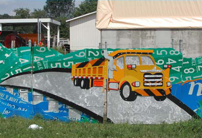
Read Between The Signs Project - Functionally Designed PennDOT Truck
This truck was my first solo creation for the fence. Because it would be placed over the existing gate, I designed it so that the two parts of the truck would split to allow the gate to be opened and closed.
Read Between The Signs Project
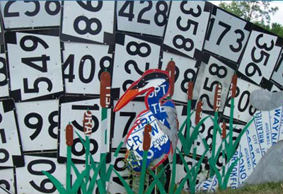
This is the leftmost portion of the pond. We choose to introduce wildlife into the nature scene here with the addition of the ducks. The surface of the pond indicates current and waves by the use of intersecting curves.
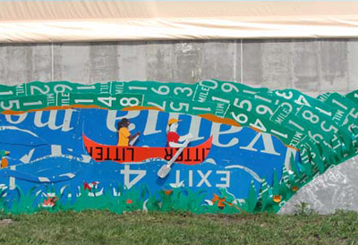
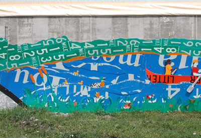
Read Between The Signs Project
We decided to go with a pond structure rather than having the entire lake surround the town area. The canoe and the people inside are pushed forward by the use of metal tabs to make them stand out as part of the foreground.
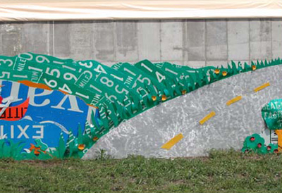
Read Between The Signs Project
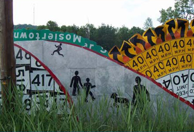
This is the outer road for the town area. The grass was cut and bent in a way to make it feel more organic. This was a pain cutting these shapes with the jigsaw but the added effect is definitely worth the effort.
Read Between The Signs Project
This was the stopping point during my first summer on the read between the signs project. The following summer we picked up the fabrication with the pond and bridge.
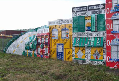
Read Between The Signs Project
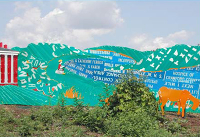
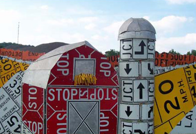
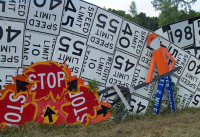
This section was made to symbolize the town of Meadville in an abstract manner, although the local media dubbed the large red building as the market house. The red building stood at 10 feet tall and needed additional support beams to keep it standing.
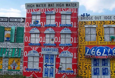
Read Between The Signs Project
The rightmost section of the town area has a couple trees fashioned in the same relief style, as some previous sections, to give them some extra sculptural volume.
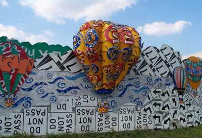
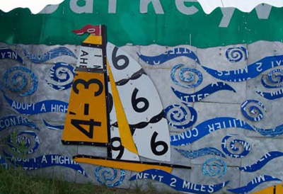
Read Between The Signs Project - 3D Hot Air Balloons
This is the 6 foot fluted hot air balloon that Julie and I created for the duration of a large portion of the summer. Each of the fluted pieces had to be customized and bent separately.
Read Between The Signs Project - I am Standing by the balloon as a reference to its size.
This is the 6 foot fluted hot air balloon that Julie and I created for the duration of a large portion of the summer. Each of the fluted pieces had to be customized and bent separately.
Read Between The Signs Project
The basket at the bottom was created by weaving metal strips and then bending those strips into a half arc. Both processes were extremely challenging and involved a great deal of patience.
Read Between The Signs Project
This is the lake region close to the large pine tree. Because of a shortage of blue signs we had to improvise with a different design. The blue aquatic shapes on top of the polished silver signs forms an abstract representation of water.
Read Between The Signs Project
The other half of the lake continues on the right side of the huge pine tree. You can see the continuation of the abstract water. The lighter blue swirl shapes were made by marking up the blue surface paint with the angle grinder.
Read Between The Signs Project
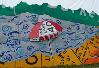
The parasol on the beach was constructed as a three dimensional object. As the read between the signs project matured it would be common-place to have three dimensional objects placed among the two dimensional objects to add a sculptural quality to the work.
Read Between The Signs Project
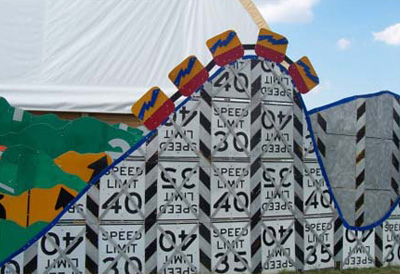
The roller coaster section came close to the height of the multicolored hot air balloon. Like the balloon, it needed to have extra support beams behind it to keep it from falling over.
Read Between The Signs Project
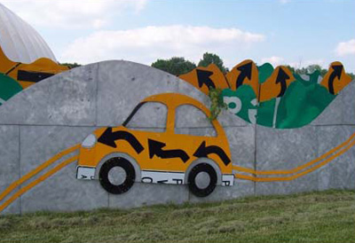
From the roller coaster section we move into country-side highway scenery. This is my favorite part of the fence because the car is on the wrong side of the road assuming it is made to mimic a place within the United States.
Read Between The Signs Project
The fence project paid homage to the numerous country fairs that happen within Meadville and the surrounding communities. Notice the ribbon like streamers at the base of the stage. That is where I got the idea for the ribbons on the hot air balloon baskets.
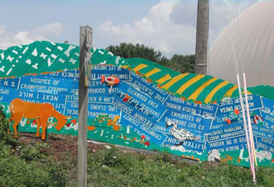
Read Between The Signs Project
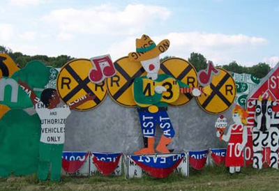
The fairground theme continues as livestock is introduced to the fence content. I like how the color and text of the signs come together to create the pattern defining the body of the cow.
Read Between The Signs Project
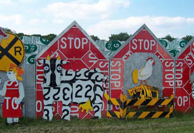
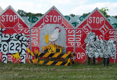
The sheeps whool in this image is made up of small swirl cuts of metal. These cuts are near impossible with the standard jigsaw and were done with a plasma cutter.
Read Between The Signs Project
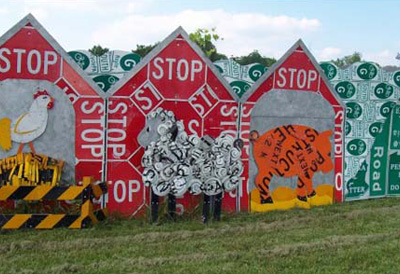
I enjoy what is happening coloristically at the ground section at the base of the pig's feet. This is a good example of the difference in color between reflective and non-reflective yellow signs. This was helpful I used in choosing yellows for the truck.
Read Between The Signs Project
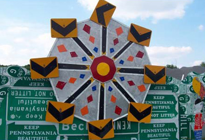
The Farris Wheel is the only kinetic sculpture on the fence. This wheel turns with the aid of a motor which is powered by a junked solar panel. The seats are loosely attached and allowed to swivel back and forth as the wheel turns.
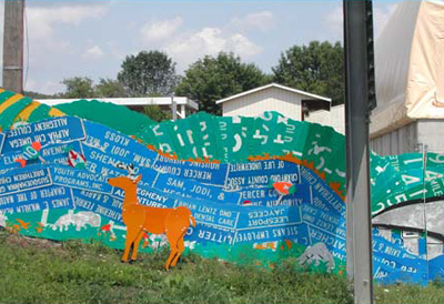
Read Between The Signs Project
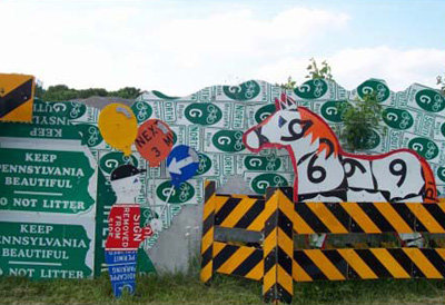
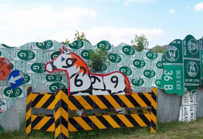
The freestanding sculptures that are in front of the fence are held upright and in place by sign posts. The grass area within the freestanding fence is hard to cut for trimming purposes so it is allowed to grow making it seem more like a mini pasture.
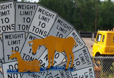
Read Between The Signs Project
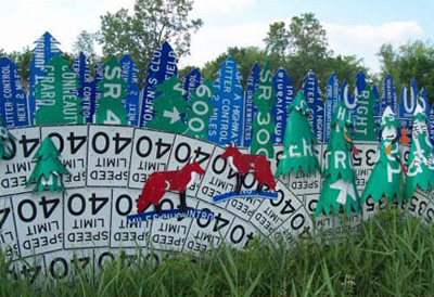
Here is a straight on shot of the horse and pasture area. Notice how the use of the red outline helps pull the horse out in front of the white and green background.
Read Between The Signs Project
The trunks and canopies of the trees are rounded allowing them to protrude off of the silver background. This same principal was used for the trees in the town and winter sections.
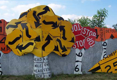
Read Between The Signs Project
Around this forest section the leaves start to change, ushering in the fall season. The main idea is to encompass all four seasons within the length of the fence.
Read Between The Signs Project
Meadville is also known for its abundance of fresh produce from the surrounding farms, so you will see a good amount of farm land represented on the fence. The fields in the background are composed of different strips of color.
Read Between The Signs Project
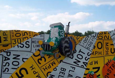
A three dimensional tractor can be seen cresting the hill. The tractor is in great detail from the tire tread to a series of carefully drilled holes on the exhaust stack, which mirror the real thing.
Read Between The Signs Project
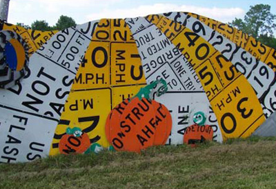
Pumpkins make an appearance here on the fence. You can see the continuation of the rolling hills created from multiple arcs of alternating color.
Read Between The Signs Project
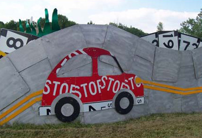
The rolling hills now disappear behind another highway section. The top of the red car and the road propagate the wave-like quality that is carried throughout the whole fence mural.
Read Between The Signs Project
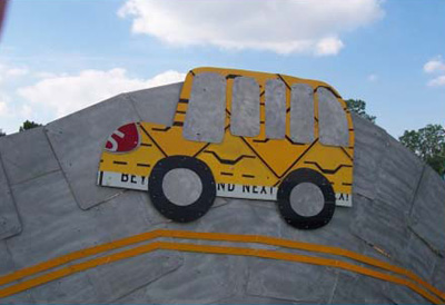
We have a bus on the other section of the highway section. You can see how the buffed silver sign backs can be used to create a convincing road surface and allow the black signs to define smaller sections like the wheels on the bus.
Read Between The Signs Project
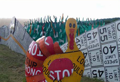
A close up of the free standing turkey also doubles to illustrate a better perspective of the wave-like quality that the fence, in the background. The tail feathers of the turkey were fabricated using the same bending device that we used on the fluted hot air balloons.
Read Between The Signs Project
This part of the fence begins to show the transition into the winter months. The alternating "Speed Limit" and "Weight Limit" signs create a nice rolling texture on the fence depicting snow covered hills.
Read Between The Signs Project
The leaf pile can be seen in better detail from this shot. The yellow outline on the leaves begin to introduce a sense of depth of the leaf pile. You can also begin to see another adjacent hill in the background constructed out of slightly different state route road signs.
Read Between The Signs Project
Once again you can see the use of the red outline behind the heron to allow it to stand out from the background which has a similar color tone.
Read Between The Signs Project
This is made to symbolize a dam with people's silhouettes seen as shadows against the light of the sun behind them. You can also see the overgrowth in front of the fence at this point. This began the area affectionately know as swampland.
Read Between The Signs Project
The sections of the fence in this area were more detailed at the top than they are at the bottom. This is because the overgrowth would obscure about three feet worth of the fence. To install in this area, we had to build platforms to stand on over the water ditch.
Read Between The Signs Project
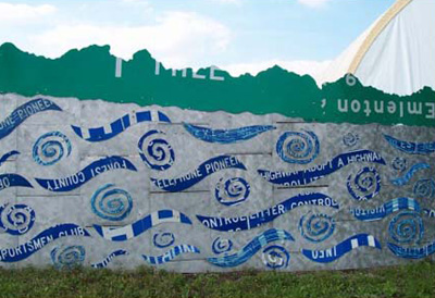
We were striving to create a view of a wintery meadow. With the tree line in the background we introduced blue to break up the spans of green trees. This also makes the trees seem like they are receding into the distance.
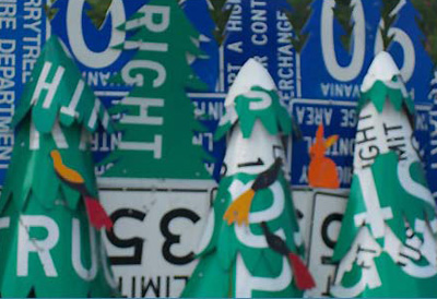
Read Between The Signs Project
A close up of the trees reveal the multiple sign layers that were created to make the sculptural quality of the trees. In some circumstance we introduced a layer of white between the overlapping layers to mimic snow on the branches.
Read Between The Signs Project
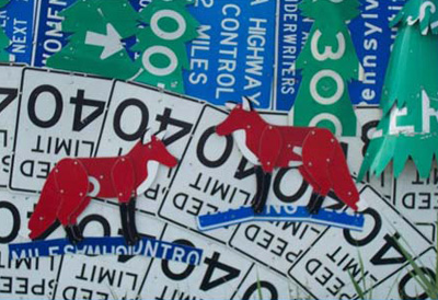
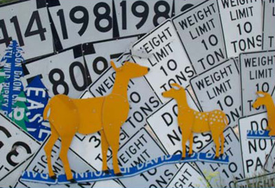
This is a close up shot of the wild life additions to the fence. We added a blue line around their feet because they appear to be floating without the presence of this line.
Read Between The Signs Project
In the upper left section you can see how the multiple patterns of white and black signs work together to create a series of hills.
Read Between The Signs Project
This was the extent of the fence during my second summer internship. You can see some of the objects behind the fence that the mural was created to conceal.